WaitLess is an appointment management and customer check-in system designed for companies to manage visitors and appointments. The application was built as part of an Advanced Software Engineering course at UC San Diego. Click here to check out the live application!

Frontend/Backend: HTML, CSS, jQuery, Javascript
Testing: Code Climate, Nightwatch.js
Other Tools: Gulp, Travis CI, Github, Mocha, JSHint, apiDoc, Heroku
WaitLess was built using a software engineering pipeline that simulates the environment of a real software engineering team. We utilized many tools for documentation, testing, code linting, and continuous integration. As a whole, we worked together to make sure that our code passed high quality standards and that every iteration on our application was integrated into our pipeline.
Individually, I was responsible for designing the front-end components of the application. Specifically, I worked on designing the application's home page, the application logo, and the look and feel of UI elements and tools within the application. Some elements of WaitLess were redesigns from previous iterations, and I spearheaded efforts to modernize the website and provide a fluid and enjoyable user experience.
Our project's home page is one example of an area of the project that I worked on. The previous homepage was clunky and not very descriptive of the project. Below is a screenshot of the new project homepage. The design was inspired to feel "weightless" and to convey a sense of modernity and innovation.
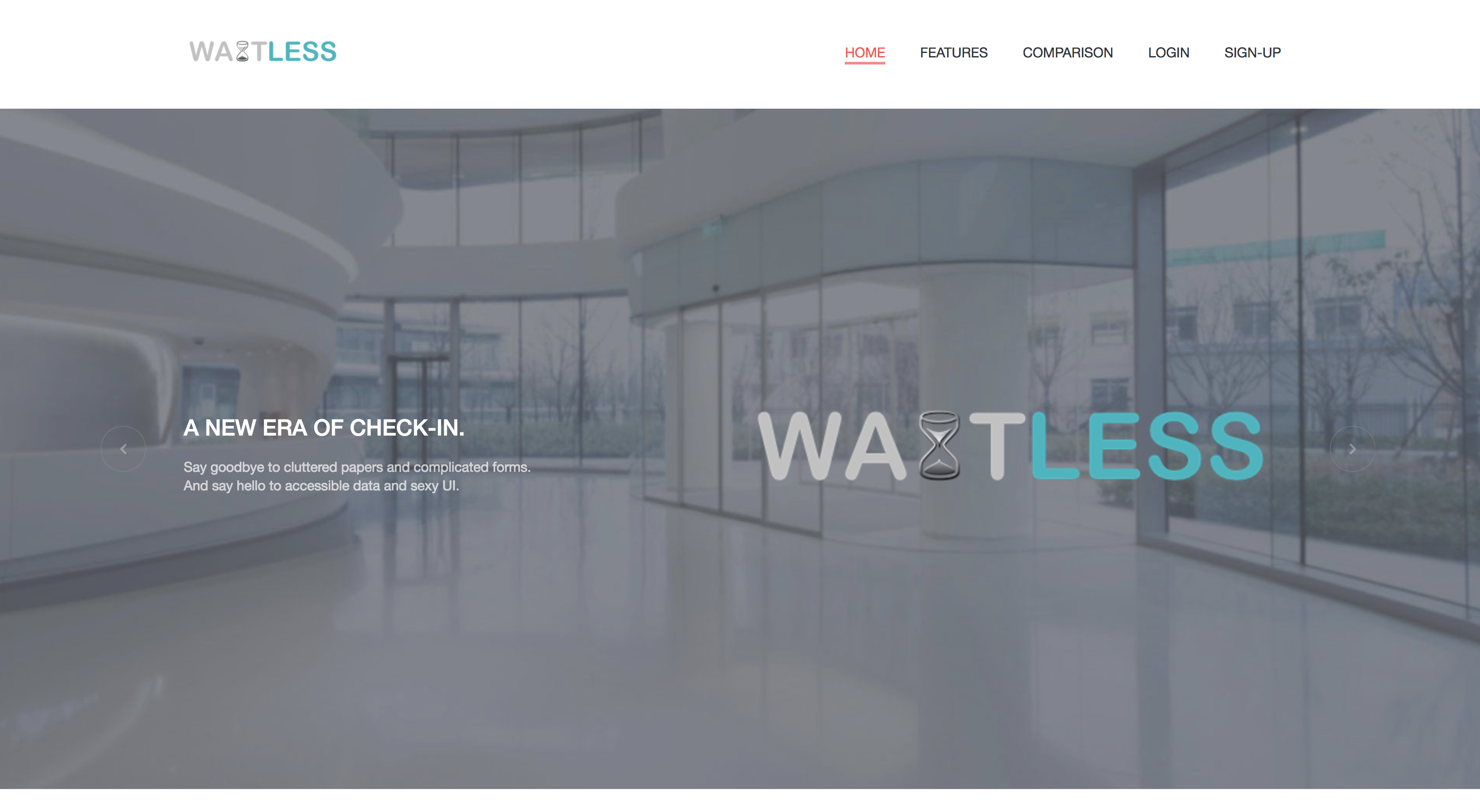
In working on the front-end elements of the application, one of the themes I wanted to follow was "new and innovative." I didn't want to give off the impression that our application was old and dated. A lot of enterprise software that small companies use was designed decades ago, and we wanted to present a fresh approach to appointment management. My goal was to combine an attractive and usable user interface without compromising the functionality of WaitLess.
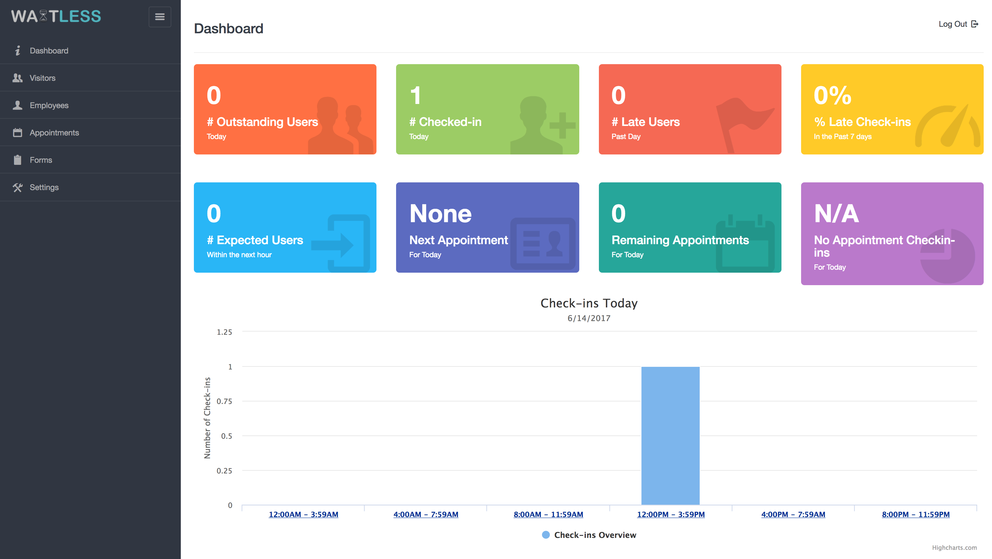
Below is a screenshot of the final design I implemented for WaitLess's administrator dashboard. The most useful information is immediately available and can be digested quickly and easily. Using charts like the bar chart on the bottom of the screenshot proved to be a great way to graphically convey important information.
Overall, I felt like this project was a success in implementing modern best practices in design principles. As a team, we were able to create an application that customers truly enjoyed using. Personally, I believe that I was able to design and implement an enaging and practical user interface. This project taught me a lot about design, and even more about working with a team, and I look forward to creating and designing more web applications in the future!